Now that the mobile-first index is officially over half of the search engine results page, focusing on mobile optimization for your site is more important than ever before. Since Google will likely be using the mobile versions to rank, it’s so important to ensure that your site follows mobile best practices.
This will not only help your users have a great user experience but will also help improve your keyword rankings and organic traffic. Here are the top factors to consider for mobile SEO in 2019.
1) Crawlability
Make sure that your robots.txt file is not blocking files on your site that help render the page, such as CSS, JavaScript or images. These elements are essential to helping Google detect that your site is built to display and work well on a mobile browser.
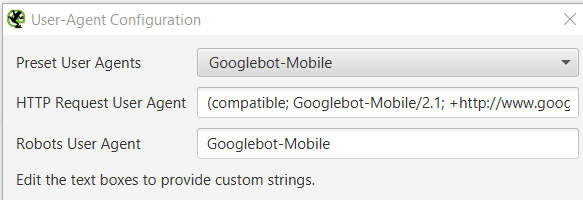
To understand how search engine spiders see your mobile pages, try crawling them with a mobile bot with any web crawler. For example, Screaming Frog has this feature:

2) Page speed
As part of the July 2018 rollout, mobile page speed is now a ranking factor for mobile. Here are some tools to help evaluate your site’s mobile speed:
Chrome User Experience Report: A public dataset of key user experience metrics for popular destinations on the web
Lighthouse: Part of Chrome Developer Tools for auditing the quality (performance, accessibility, and more) of web pages
PageSpeed Insights: A tool that indicates how well a page performs on the Chrome UX Report and suggests performance optimizations
3) UX & design
Ensuring your site is designed for mobile users is key. Aside from aesthetics, there are many technical mobile usability elements to take into consideration when designing your site:
Flash use: Most mobile browsers do not render flash and the plugin may not be available on your user's phone – avoid using flash and use HTML5 instead.
The meta name=” viewport” tag: The meta viewport tag gives the browser instructions on how to adjust the dimensions and scaling of the page to the width of the device. Without it, mobile browsers may alter the appearance of your site, providing a poor mobile experience for users.
Interstitial usage: A full-screen pop-up often represents poor user experience as it can be difficult and frustrating to try and close these on a mobile device, leading to a high bounce rate.
Touch screen elements: Make sure your touch screen elements are suitable for people’s fingers. If your buttons are too big or too small, they could accidentally click an element they didn’t mean to.
4) Google Discover
Formerly known as Google Feed, this update from Google is starting to replace the basic Google Search box on mobile devices. Google Discover presents with all the features you would find in Google Feed, including news stories and other information Google thinks might interest you.
Although not much is known yet about Google Discover and how to optimize for it, some SEO best practices remain.
Creating quality, engaging content that encourages sharing, as well as using images and video will help your site rank in the Discover feed.
