Web design is constantly evolving. New trends and subtleties arrive every year, stretching our view of what’s in. So far in 2018, we’re already seeing designers challenging the status quo and pushing last year’s trends further.
Get familiar with the web design trends you need to know now.
1) Broken grid and asymmetrical grid layouts
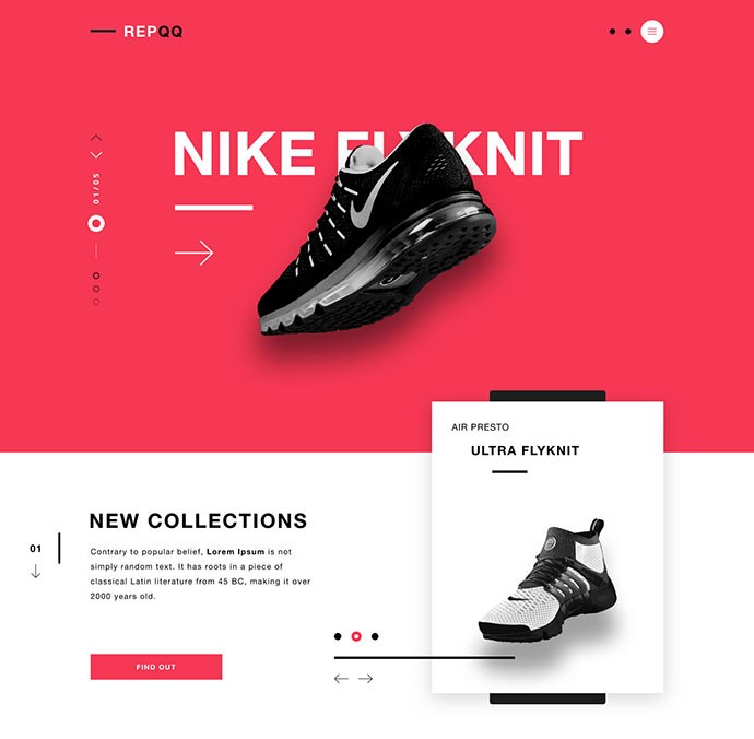
Designers are trying to ditch the symmetrical cookie-cutter template layouts by shaking up the grid.
Broken grid and asymmetrical grid layouts feature jauntily overlapping elements that seem randomly placed. This desire to jump ship from conventional layouts comes from wanting to stand out from the crowd and break the rules.
However, many asymmetrical layouts still do follow grid guidelines. This keeps the layout balanced and aesthetically pleasing—just not perfectly symmetrical.
2) Custom illustrations
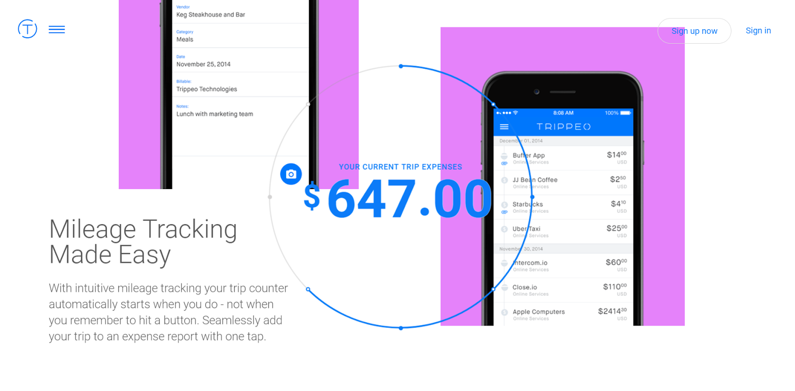
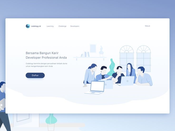
Custom illustrations are still steadily trending up. Companies are looking for new ways to express their brand and products.
Illustrations bring a fun, energetic vibe to your brand—especially when the use of other imagery and photography is limited. Take digital marketing for instance. There are only so many photographs of people sitting at a desk that can help communicate our services. Illustration adds personality, charm, and clarification where photography can’t.
3) Fluid shapes
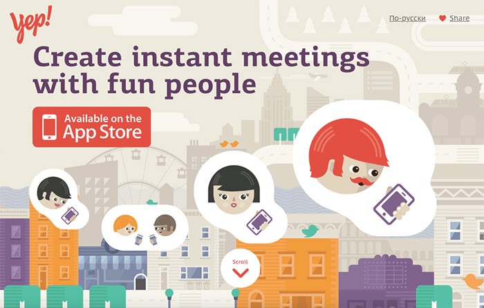
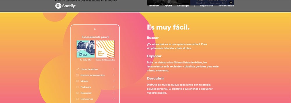
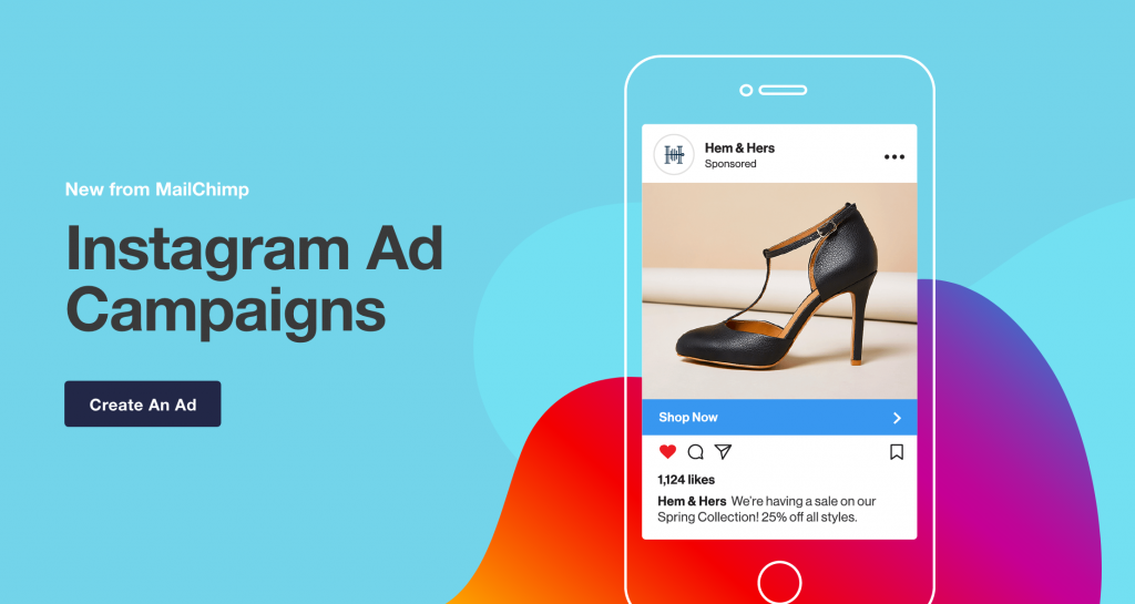
Geometrical shapes, or poly shapes, have dominated websites in recent years but in 2018 we’ll see a more rounded approach. Fluid shapes are softer, trading sharp edges to rounded corners especially in the ever-popular card-based design.
Even animations are becoming more fluid with smoother transitions. You’ll also notice fluid, lava lamp-esque shapes, which create a playful dynamic between reality and cartoon.
4) Bold typography
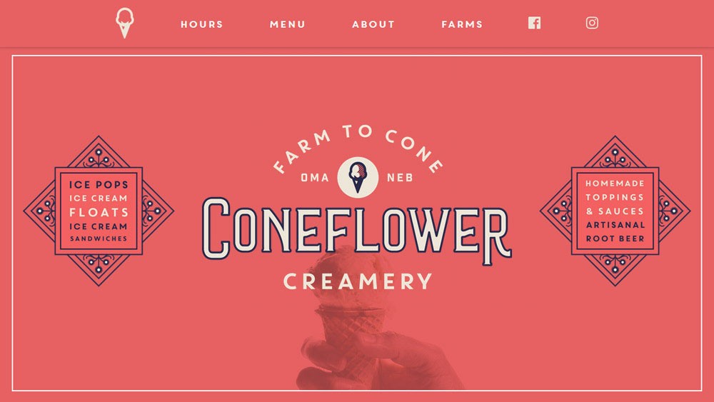
This trend is still going strong with the addition of lovely footed serifs. With advancements in screen resolution and font support, designers are able to get a little more creative with what once was thought to be only for print.
These advancements have helped handmade fonts come out of the woodwork. Bold typography is prominently displayed, which creates a strong contrast to other elements. This helps draw the user’s attention to the most important headers.
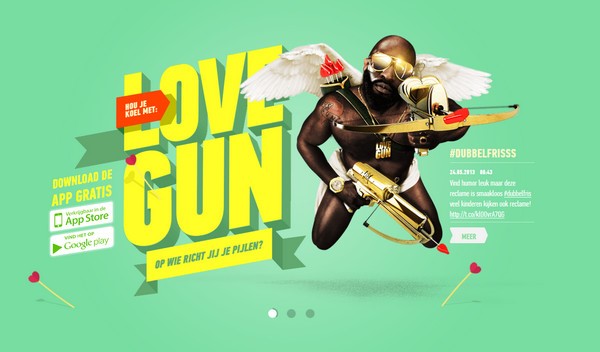
5) Interactive content
Animation is becoming so popular that users practically expect things to move. Designers are taking these animations a step further to get the user to actually engage with their site.
Scrolling animations and page transitions echo this move. This interactive format can be used to tell a story and mysterious rollover elements entice the user to want to learn more.
--
On a design blog post binge? Check out Anna’s post on why well-designed case studies can boost your sales strategy.
