A little less than a year ago, Google officially rolled out expanded text ads (ETAs) to advertisers. This came after the tech giant announced several AdWords changes at their annual Performance Summit in May of 2016.
In a blog post about the Summit, Google claims, “To help marketers succeed in this mobile-first world, we have redesigned AdWords -- from the ground-up -- and re-thought everything from creatives and bidding, to workflow and measurement.”
One of their most exciting AdWords announcements was expanded text ads—what advertiser doesn’t love extra room for copy? Meanwhile, responsive display ads, which rolled out around the same time, didn’t get nearly as much attention.
That’s why we’ve put together a celebration of the unsung heroes of AdWords: responsive display ads.
What are responsive display ads?
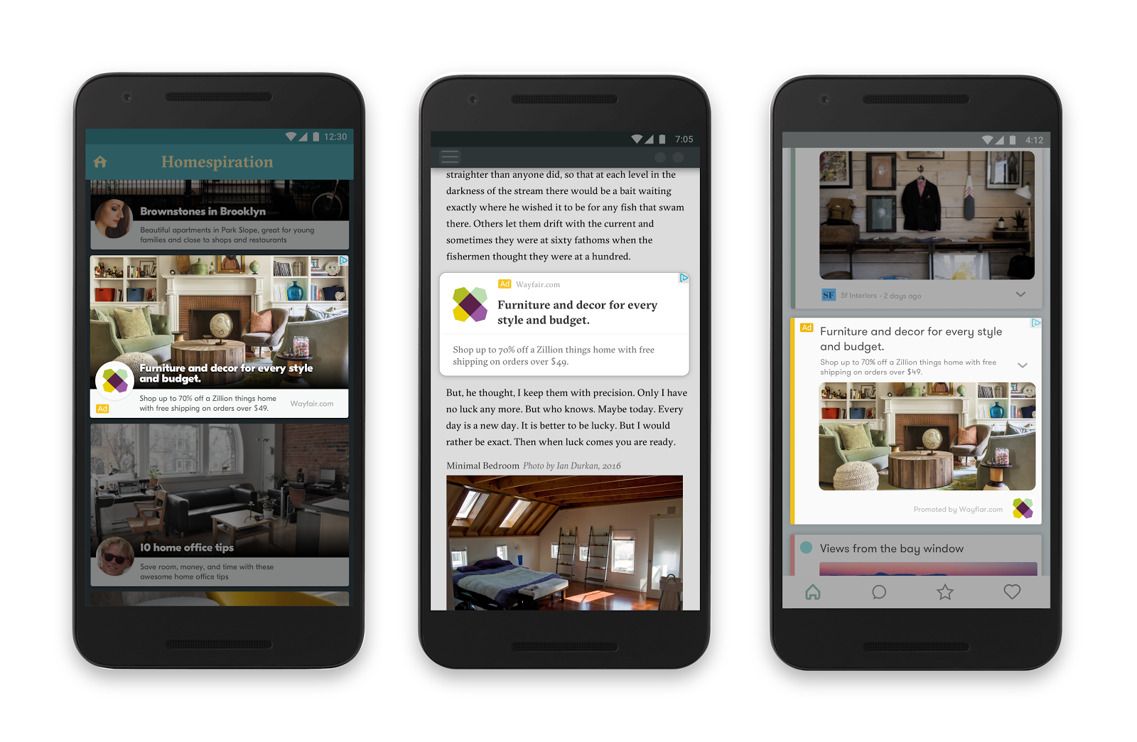
In a nutshell, responsive ads automatically adjust their size, shape, and format to fit just about any eligible ad space on the Google Display Network (GDN). Depending on the placement, responsive ads can appear in three different formats: native, image, and text.

Source: http://marketingland.com/google-adwords-device-bidding-text-ad-changes-178320
The anatomy of a responsive display ad
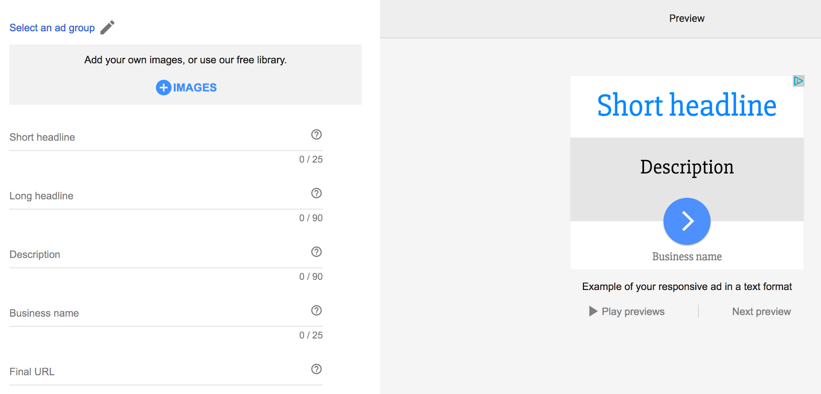
Ads (especially ones on the Display Network) can be tough to build out. That said, a responsive ad consists of only a handful of customizable elements. Fill in the required fields, add one or two images, and your ad is ready to launch. It’s that easy.

Company logo/images: The company logo is optional but responsive ads need a square and landscape (1.91:1) image for the native and image formats to work. If you’re in dire need of photos, Google even provides stock images based on your site’s content to make it even easier.
Short headline: The short headline is the first line of your ad (25 characters or fewer) and is displayed in placements where ad space is tight. Use this copy to entice users with a quick call-to-action (CTA) or unique value proposition (UVP).
Long headline: The long headline (90 characters or fewer) shows in place of the short headline in larger ads. If possible, front-load this copy with CTAs or promos, as Google sometimes truncates the long headline and description, depending on the size of the placement.
Description: [Insert elevator pitch here]. The description can be up to 90 characters long—use this field to add more context to the headline. Again, don’t shy away from CTAs. Front-load them if possible.
Business name: Not a trick question—just enter the name of your business or brand.
Final URL: This is where users go after clicking on the responsive ad. Google also gives you the option to add a tracking template.
The benefits of responsive ads
1) Save time and money
As mentioned above, responsive ads are extremely easy to create. There’s no need for a designer, Google provides stock images if needed, and setup can take less than 5 minutes.
2) Enjoy higher click-through rates
While it’s not guaranteed that responsive ads will yield higher click-through rates, we’ve seen significant increases when comparing responsive ads to image ads. At the very least, responsive ads are worth a test.
3) Show ads across all devices
Don’t bother creating sets upon sets of banners in order to show ads across all devices. With responsive ads, Google does all of the heavy lifting. No matter the screen size, responsive ads adapt seamlessly.
4) Copy, copy, copy
With a headline and a description that can be up to 90 characters long, responsive ads are by far the longest ads you can create on any of Google’s networks. Use this extra copy wisely to entice potential customers.
---
What’s your favorite responsive ad feature? Has your business already tested them? Tweet us @Perfect_Search.
