Communication is key--especially when it comes to design. Whether you’re creating your own branded materials or working with third-party designers to help out your company’s swamped design team, you need to be able to communicate effectively and efficiently.
Ideally, every company would have a brand guideline PDF that explains every intricacy of your design components. Effective and efficient? Check and check.
Unfortunately, many businesses--especially smaller companies--don’t have the resources to do so. And that’s okay. That’s why I’ve put together the key brand elements your team needs to be able to convey to whoever works on your design presence.
When you don’t have a complete brand guideline, this two-part shortlist will help you put together an easy brand style guide for your business. In Part I, we’ll dive into brand logos and colors.
Logo style guide
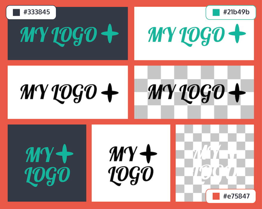
You might think that most companies only have one logo. It’s not that simple. Even if you’re a small business, it’s common to have one logo in color and one in black and white. And that’s just the beginning.
Logo size
Because logos are used in many different formats for different purposes, every company should have multiple options to make sure you’re making the best of each space.
A common variation companies should have is a horizontal logo and a vertical logo. This orientation switch is crucial for the social media world. If your company has a long horizontal logo, it’s tough to fit into that square box that is used widely by sites like Facebook and Twitter.
Having a stacked version also helps when trying to save space on smaller formats like Google display ads.
Of course, using your logo symbol in place of your full logo is another good alternative depending on how well known and/or how descriptive your symbol is.
Logo color
Like I mentioned above, a must-have logo variation is a color logo versus a black and white logo. Here’s why.
If you have a logo that has multiple colors, it may be hard to overlay and be seen on certain images or backgrounds. Having an all-white or all-black version helps the logo to be more universally used and stand out in necessary cases.
Logo format
As much as I’d love to get into the differences between file formats like JPEG, PNG, TIFF, GIF, EPS, AI and PSD, all you really need to know is that PNG, GIF, PSD, EPS, and AI are best when handing off your logo to a third party.
PNG and GIF both offer transparency options while JPEG and TIFF do not. AI, EPS and PSD are editable vector- and pixel-based formats, meaning you need a special program to open them and the logo is workable.
Transparent backgrounds are necessary when you want to use your logo across multiple platforms. If you don’t send your logo on a transparent background, you’re trusting the third party to either eliminate the background themselves or take your uniquely shaped logo and use it as an ugly rectangle or square. Don’t let that happen!
Know when to send the appropriate logo format. You’ll save everyone a lot of time and effort.
Color style guide
Believe it or not, there are many ways to describe a color. ROYGBIV is what they teach you in elementary school art class, but the color world extends far beyond this rainbow.
The four main formats are Pantone, CMYK, RGB, and Hexadecimal (hex).
Pantone Inc. is a company that created the Color Matching System. This system standardized colors so they could be used across different manufacturers and industries. Most of their colors are based on the combination of 13 base pigments and are widely used in printing, paint, fabric and plastics.
Though Pantone is used in the printing world, CMYK is more commonly used by the majority of printers around the world. CMYK refers to the combination of four inks used in color printing: cyan, magenta, yellow, and key (black).
Unlike Pantone and CMYK, RGB is the mixture of light instead of pigment. It uses the additive color model in which red, blue and green are combined to reproduce a wide variety of colors. RGB was created for the digital age for the screens of televisions and computers.
Hexadecimal colors are specified with RGB to be used in HTML for use in browsers. Hexadecimal colors use two integers between 00 and FF for red (RR), green (GG), and blue (BB).
Okay, so what does this mini-color lesson have to do with you? Well, you probably spent a lot of time choosing the exact colors for your brand. Know that there’s more than one way to communicate that color to a design team.
In order to communicate these colors across people and programs, you need to use the correct format. When creating graphics and logos, you can’t just say your colors are blue and yellow. Trust me.
When working with a web designer, you use RGB or hex colors. When working with a printer, you normally use CMYK and in some cases Pantone. When working with an interior designer, you use Pantone. Follow these guidelines and you’ll never face a color mix-up again.
--
Scrambling to get your logos and colors all organized? No rush. We’ll follow up with Part II to our Easy Brand Style Guide shortlist soon.
Don’t forget to check out the 12 design terms even non-designers should know.
