Say you’re traveling to Japan and you don’t speak a lick of Japanese. What do you do? You would usually learn a couple of key phrases that could help you get by or even bring a little pocket book with translations.
The same idea applies when you talk to people in different industries or roles. It’s always a good idea to brush up on their jargon so that you can communicate effectively when working together. While it seems like a small thing, it could make the collaborative process incredibly more efficient.
This is especially true in an industry like digital marketing. While my coworkers have to deal with way more acronyms and specialized terms like CPC, CTR, impressions, and ROAS, I, as a designer, also have terms that can mean different things to different audiences.
Here’s a handy glossary to help you get acquainted with common design terms. That way, when you’re working with a designer, you don’t spend time exchanging dozens of emails trying to figure out what the other is saying. Bon voyage!
Ad Copy
What it is not: When talking to a designer, ad copy is not the text that sits under an image ad nor is it a text ad.
What it is: Ad copy is the text that is placed on top of the image. Usually, designers will work with content writers to compose the perfect balance of text and image that will entice the demographic that you’re targeting.
Alignment
What it is not: A term used in dungeons and dragons, a term referring to your tires or your bad back.
What it is: Arrange text in a straight line either left, top, right or bottom aligned.
Banner
What it is not: A collection of letters adorably strewn together for a birthday party.
What it is: A banner is an online advertisement embedded on sites that are linked to the advertiser in the hopes that someone clicks on it and learns more about what you do or what you’re selling.
Brand Guideline
What it is not: A brand guideline is not what you think your brand is based on seeing previous ads run by your company.
What it is: A brand guideline is something that your company actually puts together so designers can follow what to do and what not to do - it gives you fonts, colors and types of images you can use and lets you know how to use them.
CTA
What it is not: Chicago Transit Authority (well, it is, but not in this context).
What it is: Call to Action - these are usually buttons that read something like ‘Learn More’ or ‘Buy Now’ urging the user to action.
Hex Code
What it is not: A spell type used in Harry Potter.
What it is: A 6-digit number used to describe colors on the web.
Illustration
What it is not: An illustration is not a compilation of graphics or photographs.
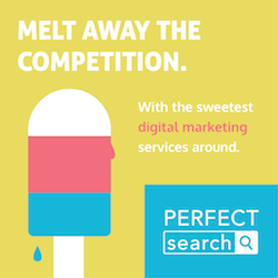
What it is: An illustration is an image that has been created by hand.


Not an illustration The popsicle is an illustration
Landing Page
What it is not: A lined piece of paper for your pencils to land.
What it is: The web page users will come to after they click on an advertisement.
Lorem Ipsum
What is it not: Something we use because we want you to think we’re smart and can speak Latin (maybe).
What it is: Dummy text to use as a placeholder in things like mockups when the actual content is not readily available.
What it looks like: “Lorem ipsum dolor sit amet, consectetur adipiscing elit. Morbi vehicula ultricies mi, eget venenatis nulla semper non. In et sagittis enim, nec suscipit mi.”
Template
What it is not: A template is not a collection of graphic ads that look slightly similar to one another.
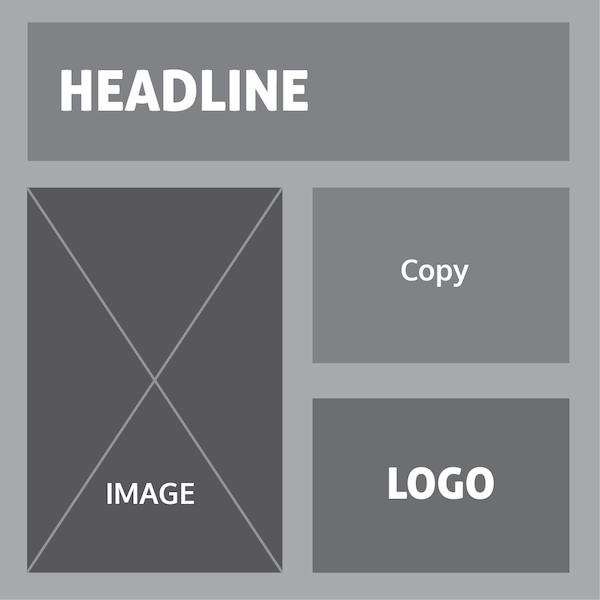
What it is: A template is a preset format for a file. See below to get a better idea of what one might look like.

A template example
Vector
What it is not: The name of a velociraptor.
What it is: A graphic that instead of being made out of a bitmap it is compiled of points and nodes - images in Photoshop are created on a bitmap while images in Illustrator are created on vectors. How do you tell them apart? Zoom in on the image - if it becomes blurry it’s a bitmap.


Vector Bitmap
Workable File
What it is not: Any of these file formats: JPG, GIF or TIFF.
What it is: All ads are composed of layers that include photographs, typography, graphics and/or illustrations. In order to edit these we need the workable file to move around each individual element. The most common format would be a Photoshop file (PSD) or in the case of Illustration, an Illustrator file (AI).
--
Just like picking up some Japanese makes a trip to Japan a little smoother, keeping these design terms in your back pocket will improve your relationship with your designer. Of course, don’t be afraid to ask questions or for clarification. Everyone should always be on the same page!
For more design knowledge, check out my post on the importance of custom images for your site. Down with stock photos!
Any design terms you desperately need to be defined? Tweet us at @Perfect_Search.
