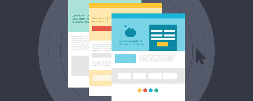
Let’s get real. There are a lot of elements to consider when creating a landing page. The design depends on your business goals, your audience, and your audience’s preferences. Whenever you’re creating a new landing page that you want to convert, you have to ask yourself some questions:
What do you want the visitor to do?
How is the visitor getting to your landing page?
What are they thinking right when they hit your page?
Use your answers to the above to inform your design. After all, there are so many types of landing pages available. Here’s a handy roundup of the most common types and their benefits. When it comes to what you want the visitor to do there are many options.
Click-through landing page
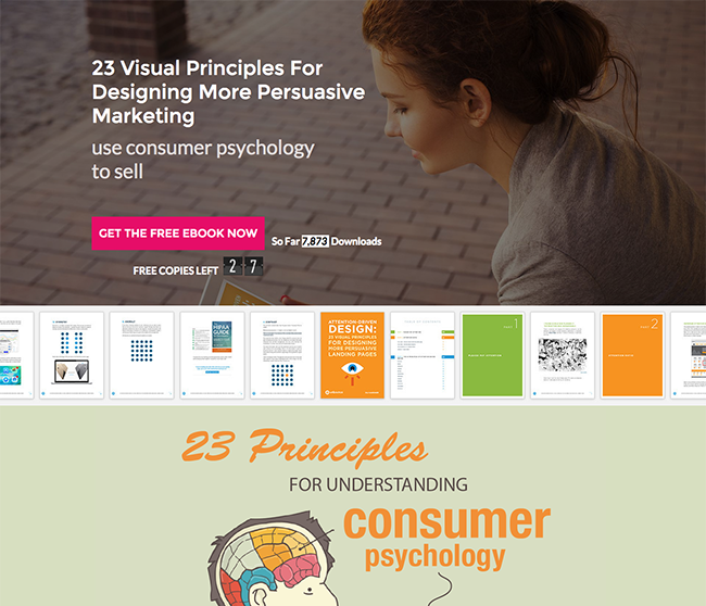
The click-through landing page is only there to tease you. This page will lure you in by offering something special and encourage you to take the next step.
The click-through landing page can be used as a gateway to your site. Its only purpose is to detail offers and make users curious to find out more. This page can be similar to a pop-up or interstitial that appears when you first land on a page or site.
Lead capture landing page
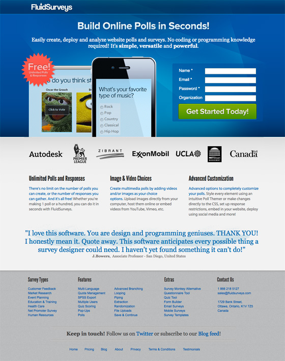
Lead capture landing pages want users’ information and will use all the design tricks of the trade to get it.
These are the simple, straightforward landing pages with one clear call-to-action, a form, and no other navigation options. They’re also called “squeeze” pages and their main goal is to gather data like emails. These are great pages to direct your users from search or display ads.
If you have a lead capture landing page, make sure the page matches the aesthetics and copy of your ads and the rest of your website for consistency. These landing pages usually offer a valuable giveaway and have great social proof to back up their service or product.
Product detail landing page
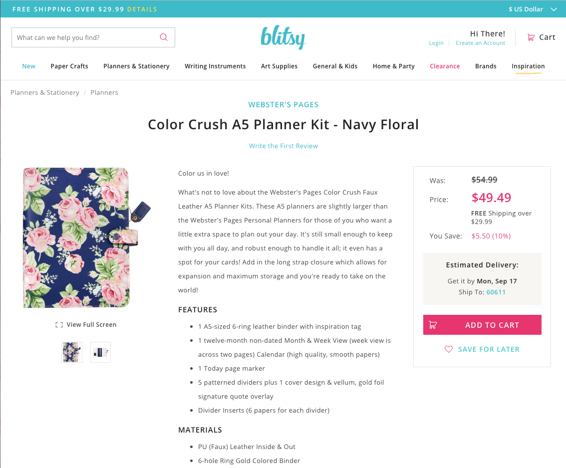
Product detail landing pages are used commonly in e-commerce. These pages show the details and related information to a product and are internal landing pages, meaning you’re able to navigate to it from the main website.
These landing pages should feature high-quality images that showcase your product. Customers want to see the product, read reviews, and interact with it. These images should include a zoom feature and multiple aspects of the product to give them a 3-D feel for the product.
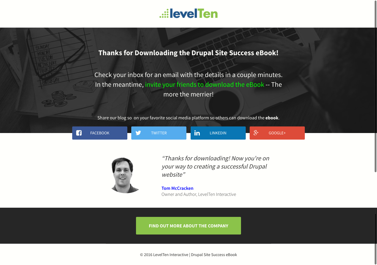
Thank you landing page
This landing page isn’t just saying thank you. It should be called the “Thanks and..” page since you’ll want to once again lead users back to your site with a value proposition.
Users land on this page after filling out any type of form on your website. This is a great opportunity to upsell your customers on another product, invite your subscribers to your newest webinar, or to ask your users to share your information on social media.
Landing page design tips
After you figured out which landing page will work best for you company you have to design and develop it. Below are a couple tips to keep in mind when designing a page that converts.
Make sure your page passes the blink test: Will someone know what your page is about and what you’re offering in 3-5 seconds? Have a compelling and bold headline and get your point across quickly.
Keep it simple: Too much content and text is overwhelming. Break up content with heading and imagery. Get straight to the point while still being tonally consistent. Remove distractions like your main navigation bar.
Add flair: Stand out by using captivating imagery that’s consistent with your brand and draws the user in.
Add social proof: How will your users trust you? Include user reviews and testimonials.
--
Ready for more design tips? Find out why well-designed case studies can seriously boost your sales strategy.
