We all know that technology is constantly changing - sometimes it changes so fast that for consumers it can be difficult to keep up. But for designers and developers, this dynamic landscape is what lays the groundwork for trends and new ideas within the design and development world as we attempt something fresh, innovative, and exciting to keep the internet feeling like the creative outlet that it is. Here are some tips and must-have features for those who want to keep their websites looking 2014 and unique while still staying simple and user-friendly.
1. Be Diverse with Fonts
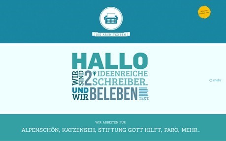
Don't be afraid to add some personality to your site. The font you choose is key in catching the readers’ attention from the moment they land on your home page. The font can be big, bold, italic, and unique. Forget safe fonts like Arial and Times New Roman: there are so many fonts out there to keep your site looking cool.
This site pushes the boundaries of design by implementing bold type and multiple font sizes to get the reader's attention and focus.
Click here to see some more examples of sites that use bold typography in their web design.
2. Minimize Amount of Pages
When creating a website, regardless of if it's for a business or for personal use, try to cut down on the amount of pages listed in the menu and on the overall site. By creating simple navigation, people will have an easier time browsing and won't get stressed out by an over-abundant amount of information.
Many people think that the more pages their website has, the better SEO rankings it will have. It’s a little more complicated than that. While it’s true that the more pages you have, the more chances you have to rank for different keywords, the number of pages doesn’t have a specific ranking benefit, according to Matt Cutts, Google’s Head of Search Spam. The key is that the pages you do have are full of quality content that actually adds value to your site and the overall user experience. Optimize the pages you need and add links to other pages within them to continually improve your SEO. The cleaner those navigation menus look, the easier it will be for others to fully embrace and appreciate your site.
3. Don't Be Afraid to Use Big Images and Graphics
What’s the first thing you want to see when landing on a page? A large section full of text that makes you feel like you're reading an essay? I didn't think so. Capture the attention of your readers and customers with large images and graphics right when they hit the home page. This would also be a perfect place to show off the fonts you've discovered by laying it on top of the image to convey a message.

This site is a great example of how to use large images and graphics on the home page that entice the visitor to further explore the site.
Click here for some more web design inspiration.
4. Responsive Sites Are the Best Sites
Nowadays, people don't only view content on a desktop computer. With access to smartphones and tablets that are essential for the on-the-go lifestyle, finding information whenever you need it is crucial. Making your site responsive will help to make sure the site appears organized and well-designed on any device, regardless of screen size.
One of the best responsive sites I’ve seen recently is this one for a dance festival. It’s full of images, content, and colors that adapt perfectly to changing screen sizes. This site serves as proof that you can make a design-oriented display that works well not only on desktops, but on mobile devices and tablets as well.
5. Consider a Parallax Design
You probably know what this is without even realizing it. A site that utilizes parallax design is a one-page site that features all of its pages within scrolling view, so you can simply scroll from one page to the next. It’s a great template and style to use if you want to make a site that is easy to read and simple to understand. The main downside is the effect it might have on SEO, as having a one-page site makes it harder for a search engine to find it (because you only have one set of meta information and one effective h1 tag.) One way to help with this aspect is to make sure that each page on the site has its own unique URL.
Best Bet: Use Parallax for any kind of portfolio site: from a freelance business to an online resume.
Are there some features of modern web design that you love that I left out? Let us know in the comment section below, email us at [email protected] or tweet us @Perfect_Search !

