So you’ve already learned all about logos and colors in How to Create an Easy Brand Style Guide For Your Business Part I and you’ve been waiting for the follow up with bated breath, right? Right.
Good news. Unlike Spiderman 3, this sequel won’t disappoint. Let’s dive deeper into typography, tone, and images and how they fit into your brand style guide.
Typography
Like your brand colors, you probably spent ages deciding on the perfect font for your company. Don’t make that time worthless! Communicate your fonts correctly so that all of your print and digital materials are consistent.
PSA: Font and typeface have become interchangeable terms with the rise of digital formats. Some super-strict experts will tell you that a typeface is something like Times or Garamond while a font is bolded Garamond in 14 point. In this post, I use font because we live in a digital world.
Styles
Typography isn’t as simple as choosing a font. You need to determine the sizing and styles you’re using for things like headings, links, and paragraph text.
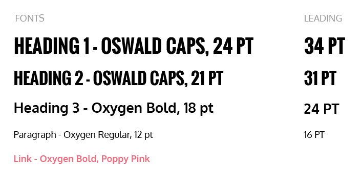
Each style should include the following information: Font family (ex: Garamond), style of that font (ex: bold, italic, etc.), size (ex: 24pt), and any additional information like color or caps.
When creating a style guide, always start with your H1. Not only is the H1 the biggest and boldest line, it’s also important to search engine crawlers. The H1 actually tells the search engine what the page is all about.
This format continues for every other style as well. Depending on the nature of your company and how complex you can include the following: H1, H2, H3, link text, and paragraph text.
You can also style emphasis, quotes, and list paragraphs. The possibilities are endless!
Paragraph Styles
Now that you have all your styles down, you need to make sure they all look good together.
Paragraph styles cover things like leading (the space between lines), kerning (the space between two letters), and tracking (the space between letters in a group).
Leading is a good paragraph style to start with. The space between lines can make a world of difference in how a user reads your text. Too little space and the text looks cramped and hard to read. Too much space and your eyes get dizzy from jumping so far to the next line.
Consistent leading for your paragraph text is a simple way to make your documents look professional (and legible!). Don’t forget to note the leading for each style!
Here’s a snippet of what the typography section of our style guide looks like.

Tone
Tone is often overlooked, but it’s a crucial part of your brand. After all, your tone conveys your unique company culture.
Is your company young, fun and passionate? You may write in a tone similar to Perfect Search. (You know, extremely witty, vibrant, and clever.)
Is your company in the finance industry? Your tone might be a little more serious and straightforward.
No matter what your tone is, make sure that it’s included in your style guide.
Images
Every company has its own personality that only the right kinds of images can convey. That’s why it’s important to include an images section in your brand style guide.
This will help your employees, agencies, and contacts understand what kind of imagery represents your company—and what doesn’t.
If you work for a bankruptcy law firm, you probably won’t be using pictures of college kids frolicking on the beach at sunset like a travel company would. If you never allow stock photos to appear on your site, your style guide should say so.
(Psst. I’m on the anti-stock images team. Here’s why custom images > stock photos.)
--
Busy creating your own brand style guide? Make sure that you’ve read Part I and you’ve brushed up on your design terminology!
