The line between user experience and SEO is and has been blurring in recent years. It’s not just about getting a lot of traffic to your site. Google recognizes that an integral part of SEO is ensuring that users have a positive experience on your site.
Read on for five SEO-centered optimizations you can make to your page to make it more user-friendly.
1) Use headlines that speak to the user
Historically, the H1 was viewed as an opportunity to leverage primary or secondary keywords on a given page. Over time, the emphasis on keyword placement has dwindled and instead experts now generally focus on introducing the contents of the page.
This is a positive movement, as keyword-driven optimizations without considering the user is a dated practice.
Use the H1 as an opportunity to ask yourself whether the headline truly speaks to the user in a substantial and enticing way. The headline should concisely convey the offering/service.
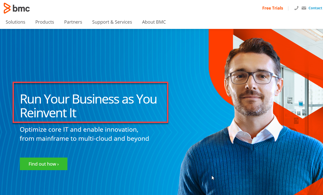
The image below includes an okay H1. “Run your business” is an unclear description, and there is no context around the reinvention aspect, so there’s definitely room for improvement here.

The example below is better. The headline naturally leverages keywords and simply conveys what it’s about.

2) Focus on speed
By 2019, most SEO-ers and developers have learned the importance of speed for a website. Nonetheless, it bears mentioning because it goes toe-to-toe with the headline for largest effect on bounce rate.
Fortunately, there are countless tools to help with the optimization of site speed or site latency. I recommend checking out Google Page Speed Insights and WebPageTest.org.
Both options are free. Here are a few additional tips or tricks for these tools:
-For WebPageTest.org, be sure to conduct 9 tests within “Advanced Settings” to find the median number for all tests and ensure that you are not benchmarking a fluke.
-Focus on the most impactful optimizations. This includes pages that receive the most visitors, optimization of resources shared amongst the most pages, and resources that have the largest potential savings for load time.
-Use a spreadsheet to keep track of load time and speed score before and after optimizations.
3) Use CTAs that create urgency
Web pages should leverage call to actions (CTAs) to elicit action and guide users through the conversion funnel. The key, however, is using CTAs that appropriately apply urgency and detail what a user can gain by clicking.
For example, the image below is visually appealing but the CTA has room for improvement. The white text blends in with the image, the actual text is not meaningful/is unclear in meaning, and there is no sense of urgency.

Look to the image below for a solid use of CTAs. The headline effectively conveys what a user will get by converting, the two options for conversion are clear, and it evokes a sense of urgency by indicating that this deal is “THIS WEEK ONLY.”

4) Show off your accolades
As the saying goes, “if you’ve got it, flaunt it!” This applies to your site too. Make sure your site effectively highlights your accolades, press, and awards.
Accentuating these things helps lend credibility to a website and eliminates barriers to purchase or conversion for users. Some options to include are:
-Positive reviews
-Industry awards
-Mentions in noteworthy publications
-Testimonials
-Endorsements
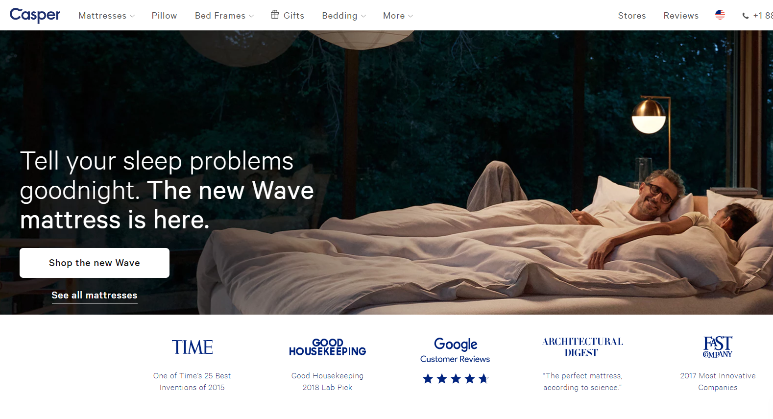
An example of a website that does a phenomenal job with this is Casper.com. Check out how they highlight their positive press below.

5) A/B test design alterations
There are often many differing opinions on what a site should look like. Whether it’s a button color or a headline, an effective way to determine the best choice is to conduct A/B testing.
Our go-to A/B testing tool is Visual Web Optimizer. By uploading a snippet to the <head> element of pages, you’re able to conduct on-the-fly tests with development resources. This is a great way to apply data to visual alterations to a website.
We also recommend creating an A/B testing roadmap that details upcoming tests, targeted metrics, mockups, and more. Plus, try to only test one aspect at a time, otherwise, it is not a true A/B test.
